Color Your Way to a Clutch: The Psychology Behind Your Gaming Setup's Palette
Photo: Unknown, CC BY-SA 3.0, via Wikimedia Commons
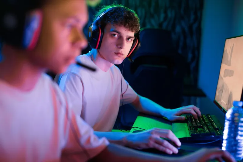
Most people think about their gaming setup in terms of specs. Refresh rate, response time, CPU thermals. The stuff you can benchmark. But there's a whole layer of your performance environment that doesn't show up in any benchmark—the visual world you've built around yourself while you play. And according to a growing body of sports psychology research, that world matters more than most players ever think about.
We're talking about color. Specifically, the color palette of your entire setup—not just the RGB on your keyboard, but your chair, your walls, your cable situation, the bezel on your monitor, the lighting temperature in the room. All of it is feeding information to your brain, constantly, whether you're aware of it or not.
Your Brain Is Reading the Room
Environmental color psychology isn't new science. Retailers have used it for decades to influence purchasing behavior. Hospitals use it to manage patient stress. Sports teams have famously painted opposing locker rooms pink—a real practice known as the Baker-Miller effect—to reduce aggression and energy levels in visiting players.
 Photo: Baker-Miller effect, via i.ytimg.com
But applying these principles to gaming setups is a newer frontier, and it's one that sports psychologists are increasingly interested in.
"The environment you perform in sends constant low-level signals to your nervous system," says Dr. Keisha Fontaine, a performance psychologist based in Chicago who works with both traditional athletes and esports competitors. "Color is one of the most potent of those signals because it operates below conscious awareness. You're not thinking about your chair color while you're playing—but your brain is still processing it."
Fontaine breaks the impact into two broad categories: activation and regulation. Some colors and lighting conditions increase arousal and alertness. Others help bring the nervous system down and promote focus. The trick is figuring out which one you actually need—and when.
What the Research Actually Says
The color science literature points to a few consistent patterns worth knowing.
Red is the most studied. It's associated with increased heart rate, heightened aggression, and faster reaction times in short bursts. One study published in the journal Nature found that athletes competing in red uniforms won at higher rates in certain combat sports. For gaming, that translates to potential benefits in high-intensity, reaction-dependent scenarios—but it can also amplify tilt and impulsive decision-making during longer sessions.
Blue consistently shows up as a focus and calm enhancer. It's associated with lower cortisol levels and improved concentration over extended periods. This makes it a strong candidate for the dominant tone in a setup used for long ranked grinds or strategic games where decision quality matters more than raw reaction speed.
Green sits in an interesting middle zone—it's associated with balance, reduced eye strain (which matters enormously for multi-hour sessions), and a general sense of ease. It's no coincidence that green is the easiest color for the human eye to process.
White and neutral tones tend to reduce cognitive noise. Clean, uncluttered visual environments have been linked to better working memory and reduced distraction—which is part of why the minimalist setup trend has real functional backing, not just aesthetic appeal.
Pro Teams Are Already Acting on This
This isn't purely theoretical. A handful of esports organizations have started treating their practice facilities with the same environmental intentionality that traditional sports franchises apply to their training complexes.
One North American League of Legends organization—whose staff requested anonymity to discuss internal practices—redesigned their team house practice room in late 2023. Out went the aggressive RGB cycling and the dark, cave-like atmosphere that had defined the space. In came cooler-toned ambient lighting, neutral desk surfaces, and a deliberate reduction in visual clutter.
 Photo: League of Legends, via cdn1.epicgames.com
"The feedback from players was immediate," says a performance coach involved in the project. "They described feeling less mentally fatigued after long practice blocks. Whether that's entirely the color palette or a combination of factors, we can't fully isolate—but we're not going back."
Fontaine says this kind of anecdotal evidence lines up with what she sees in her own practice. "I've had clients do simple things like swap out a red gaming chair for a blue or gray one and report a noticeable difference in how long they can stay focused before their attention starts fragmenting. It's not magic. It's just environment design."
Cable Management Is a Focus Strategy
Here's the one that surprises people: visual clutter—messy cables, mismatched peripherals, random objects in your sightline—has a measurable cognitive cost. Research on environmental psychology consistently shows that disordered visual fields increase cognitive load, pulling small amounts of attentional bandwidth away from the task at hand.
In other words, cleaning up your cable management isn't just about looking good on camera. It's about reducing the number of things your brain has to passively process while you're trying to make split-second decisions.
"I tell every client the same thing," Fontaine says. "Before you spend money on a new peripheral, spend an afternoon making your space coherent. It will do more for your performance than most hardware upgrades."
Building Your Palette Intentionally
So what does a psychologically optimized setup actually look like? There's no single answer—it depends on what you play, how long your sessions run, and what your specific mental performance challenges are. But there are some starting principles that apply broadly.
Start with your dominant color and make it intentional. If you're a support or strategist-type player who needs sustained focus and calm decision-making, lean into cooler tones—blues, grays, soft greens. If you play short, high-intensity sessions in FPS titles where raw reaction speed is the priority, warmer and more energizing tones might serve you better.
Then look at your lighting temperature. Warm white light (around 2700-3000K) is relaxing and good for wind-down. Cool white or daylight bulbs (5000-6500K) promote alertness and are better for active play sessions.
Finally, reduce visual competition. Your setup should have a visual hierarchy—a clear focal point (your screen) and a supporting environment that doesn't fight for your attention. Every random sticker, clashing color, and tangled cable is a tiny tax on your focus.
The Setup Is Part of the Build
The gaming community spends enormous energy optimizing the technical side of performance. Sensitivity settings, ping, frame rates—these things matter, and the community is right to care about them. But the visual environment you inhabit while you play is also a performance variable, and it's one that's almost entirely within your control.
Your setup isn't just a backdrop. It's infrastructure. Treat it like one.